( 2026 ) ( Product Designer at North )
VivaGym: from one step to the whole sales funnel.
VivaGym, a chain of more than 300 gyms in Spain and Portugal, asked North to redesign the step where people choose a membership. I had a clickable prototype in my first week on the project, and VivaGym then extended the brief to the whole online sign-up. In the proposal, payment takes one screen from a club's page and two from the home page.
ClientVivaGym, 300+ gyms in Spain and PortugalRoleProduct designer at North: design, prototypes and the user study. North's project manager handled the client relationshipTargetVivaGym's own: 20% more overall conversion in the first month after launchStatusIn development
01 · The brief
The step with the biggest drop
The first brief was step three, choosing a membership: in VivaGym's analytics, about half the people who reach it don't continue. A second brief then asked for the whole sign-up, paid with Apple Pay or Google Pay.
First briefStart
Gym
Membership
Details
Payment
Signed up
Second briefStart
Gym
Membership
Details
Payment
Signed up
02 · Today and proposed
The same four moments, today and proposed
Each moment on a phone: today's sign-up on the left, rebuilt from VivaGym's own HTML and CSS, and the proposal on the right.
Moment 1 of 4
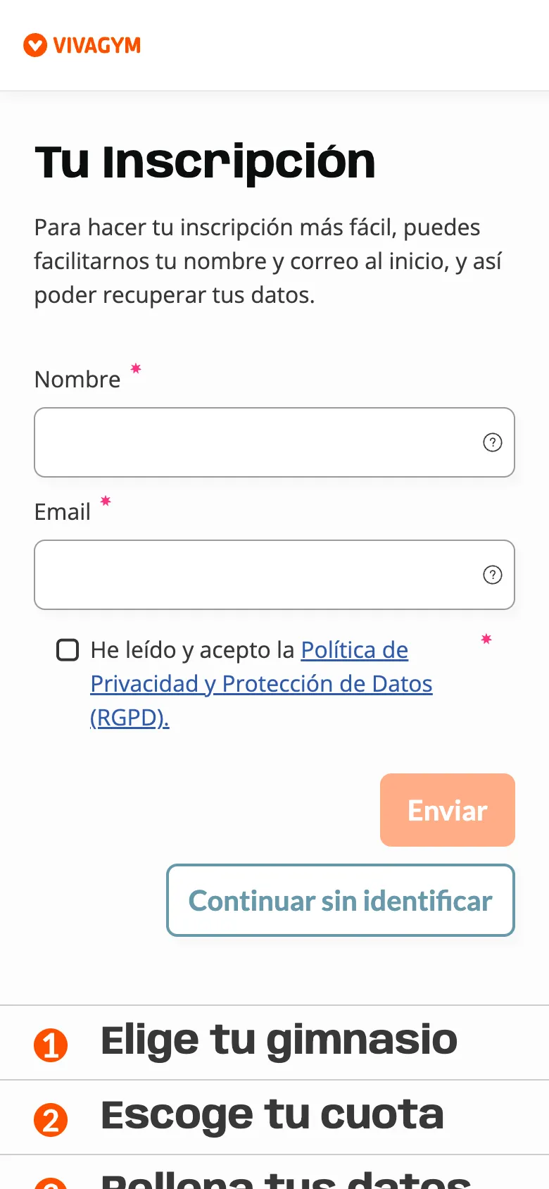
Data before the price
Today. Name, email and a privacy checkbox before any club, membership or price. And two funnels: a short one from a club's page, a long one from the home page.
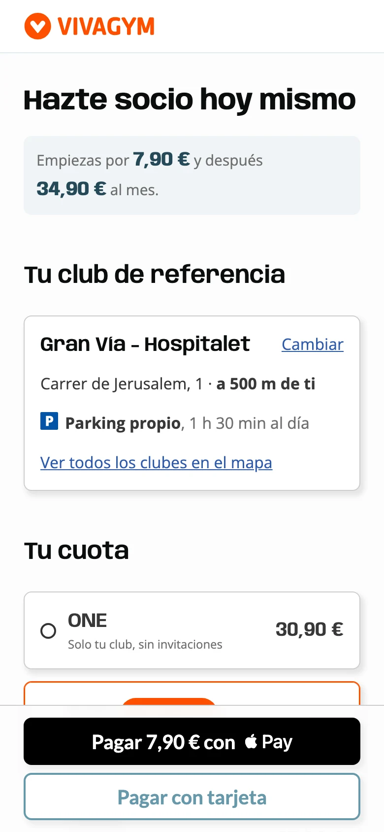
Proposal. Still two flows, by where people start, and in both the price comes before any personal data. From a club's page, club, membership and price come filled in. From the home page, the person first picks a club on the map, and prices appear once it's chosen, since they vary by club.
Moment 2 of 4
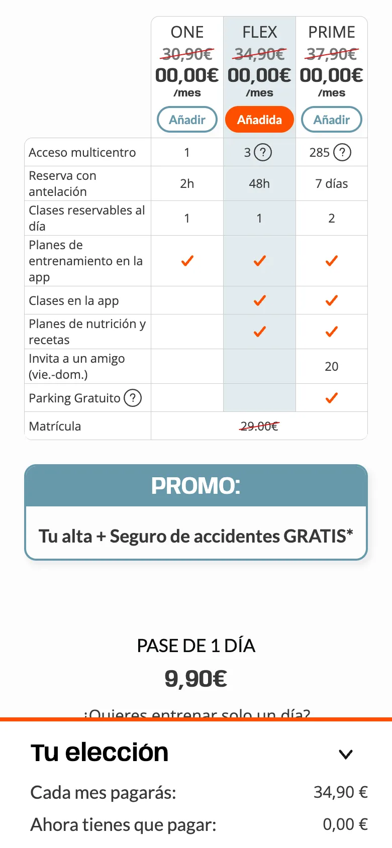
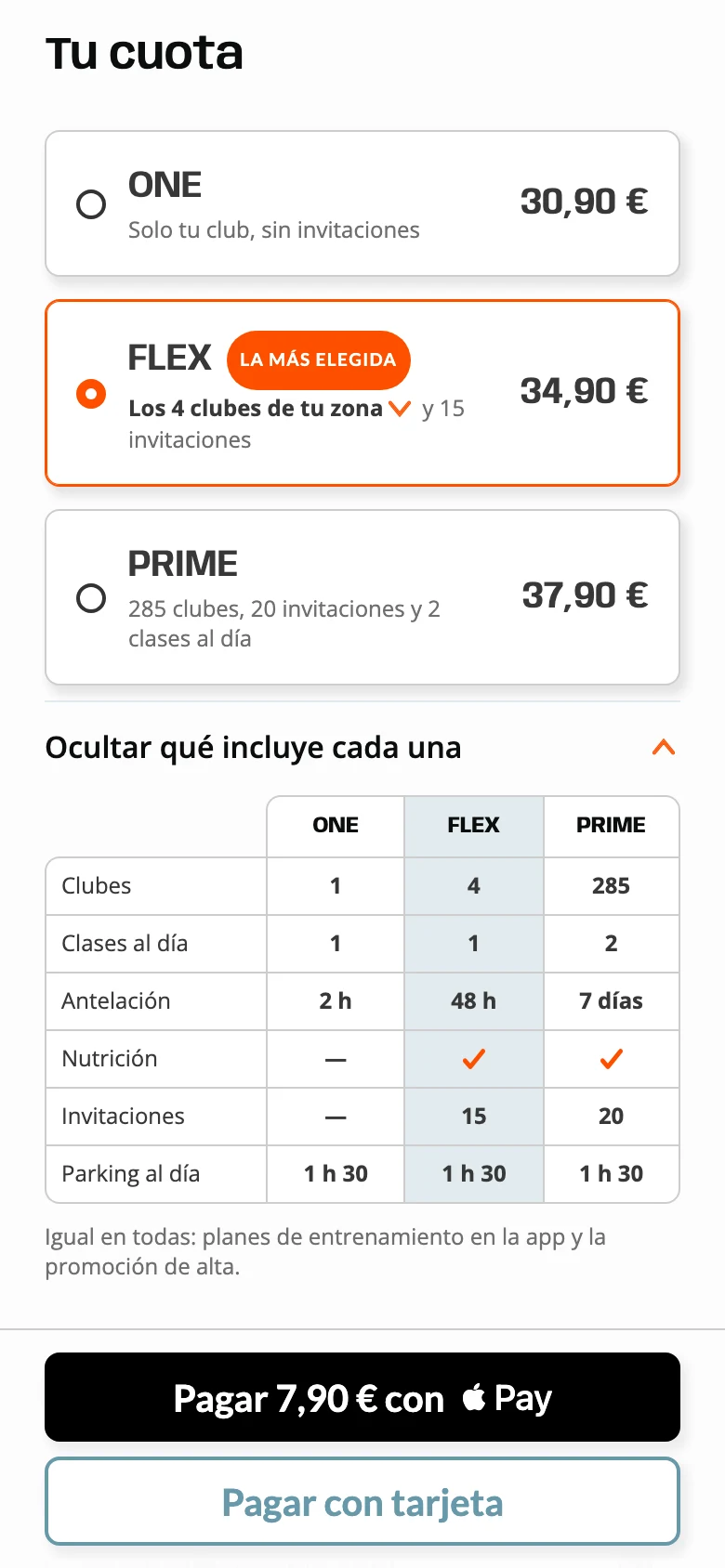
Choosing a membership
Today. Every membership shows 00,00 € with the monthly fee struck through, and a nine-row table. The step runs to four screens of scroll.
Proposal. The monthly price on each membership and what it includes, in one line. The comparison opens under the list, in six rows.
Moment 3 of 4
Filling in details
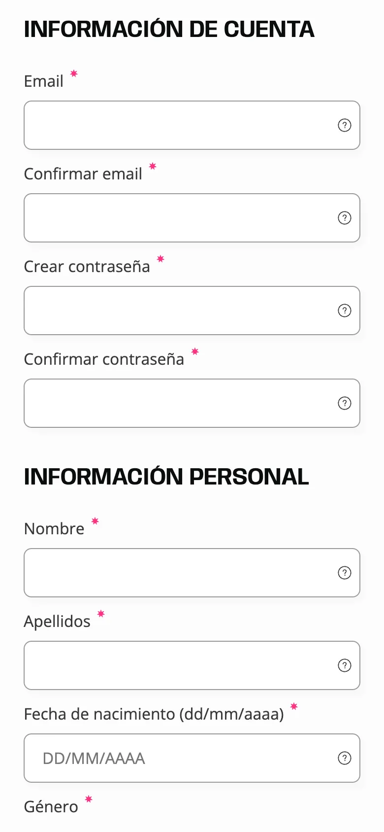
Today. Email and password, each typed twice. Sixteen fields over four and a half screens.
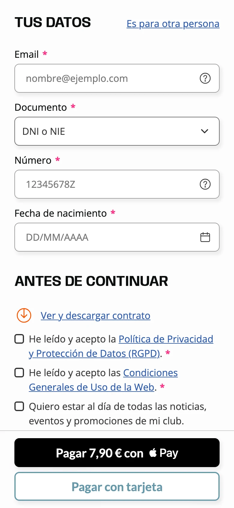
Proposal. Three fields to type: email, ID number and date of birth. Name and phone come from the wallet. ID and date of birth stay: VivaGym's system needs them, and under-16s need a guardian's signature.
Moment 4 of 4
Paying
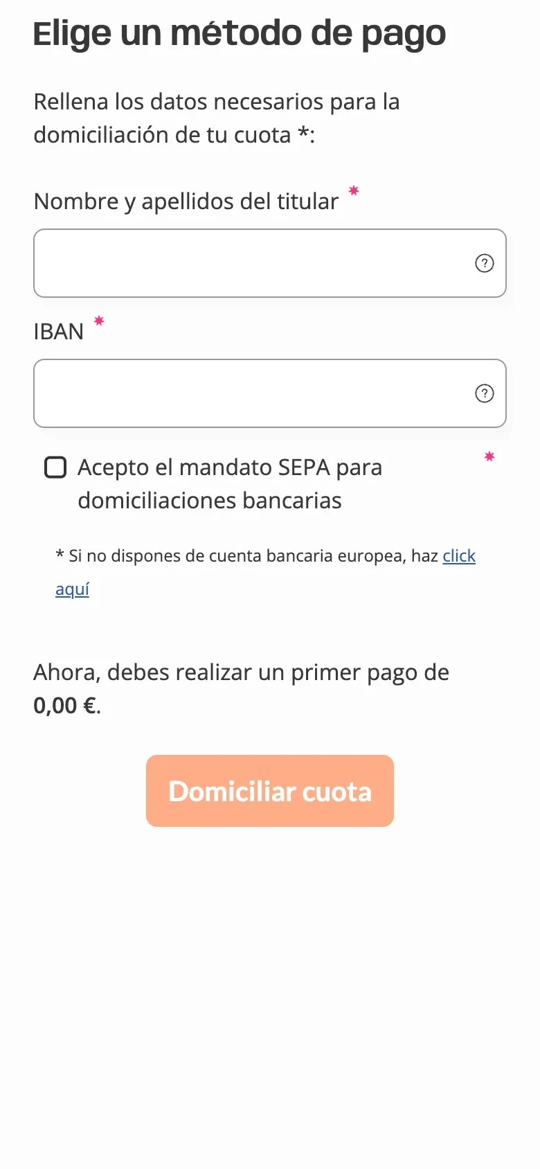
Today. Account holder, IBAN and a SEPA mandate before you can join.
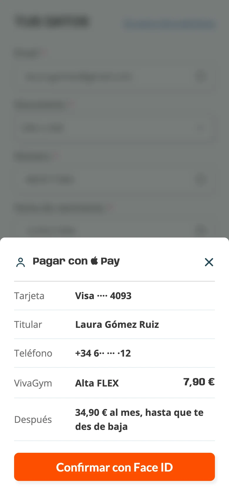
Proposal. Apple Pay or Google Pay first, card second, as agreed with VivaGym. The IBAN is asked for in the member area, after joining.
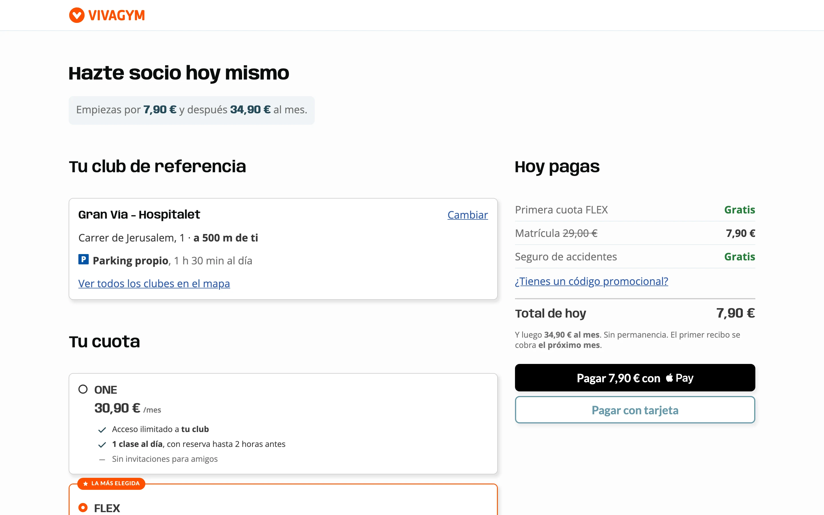
On desktop
The same screen on a laptop
Choices on the left. The total on the right, always in view.
03 · Research
What the data and the study showed
Two sources: VivaGym's analytics, read by North, and a small study I ran with ten people across eight profiles. Each person tried three versions of the membership cards on a phone and gave feedback on them.
VivaGym's analytics, read by North
8 in 10
visits come from a phone.
What changed. Every decision starts on a phone and scales up to desktop.
1 in 2
people who reach the membership step don't continue.
What changed. The total and the button stay fixed at the bottom of the screen.
Three versions of the membership cards, as tested on a phone
A · Stacked cards
Each card repeats what the one above includes. The four run two and a half times the height of the list.
B · Compact list
All four fit above the bottom bar, each with its price and what it adds.
C · Side scroll
PRIME, the most expensive membership, is three swipes away.
The four memberships on a 390 px phone screen, as tested. Dashed, what sits off screen.
The list stayed: it shows every membership at once, with PRIME in view. The study led to three changes.
From the studyFoundChanged
Prices with no referenceCards read €4 less or €3 more without naming FLEX, the membership they were measured against.Each price stands on its own.
The day-pass blockOne person tapped the day-pass block thinking it was required.Day passes and add-ons are out of the launch, agreed with VivaGym. Passes will be tested after launch, to see whether they add visits or replace memberships.
The comparison on a phoneComparing memberships on a phone took long, and the list left out detail people looked for.The comparison stays collapsed under the list and opens on tap.
04 · Impact
The target: 20% more sign-ups
VivaGym set the target: 20% more overall conversion in the first month after launch. With the same traffic, every 1,000 sign-ups become 1,200.
+20%
overall conversion: VivaGym's target for the first month after launch
200
more members for every 1,000 sign-ups, with the same traffic
An estimate. The design is one of VivaGym's levers, with price, campaigns and new clubs.
What to measure next
What I'd read 30 days after launch, against VivaGym's current funnel.
MetricWhat moves itWhy it matters
Conversion from choosing a membership to payingThe list with prices up front, and the total and button fixed at the bottomToday's biggest drop, in VivaGym's own data
Overall conversion, from start to signed upPayment in one screen from a club's page, two from the home pageVivaGym's target: 20% more in the first month
Sign-ups paid with Apple Pay or Google PayWallet first, card secondNo data yet. It decides whether most people type three fields or five
IBANs added in the member areaThe IBAN asked for after joiningUntil one is added, each monthly fee goes by card, which costs VivaGym more than a direct debit
05 · Where it stands
Approved and in development
VivaGym approved the proposal, and its developers are building it on the current site.
Three details changed after review rounds with VivaGym's acquisition and business teams.
Signing up someone else
A link under the details, instead of a choice at the start. The up-front choice confused people and gave a minority case the same weight.
One person per sign-up
The option to add a second person to the same sign-up was removed. Each membership has its own sign-up.
A Portuguese version
The sign-up in Portuguese for Portugal, with the vocabulary of VivaGym's Portuguese site and its formats: NIF tax number and 0000-000 postcodes.
More work
Full redesign of a complex platform for testing AI agents.
Creative corporate site for a live-culture group.
( 2026 ) ( Product Designer at North )
VivaGym: from one step to the whole sales funnel.
VivaGym, a chain of more than 300 gyms in Spain and Portugal, asked North to redesign the step where people choose a membership. I had a clickable prototype in my first week on the project, and VivaGym then extended the brief to the whole online sign-up. In the proposal, payment takes one screen from a club's page and two from the home page.
ClientVivaGym, 300+ gyms in Spain and PortugalRoleProduct designer at North: design, prototypes and the user study. North's project manager handled the client relationshipTargetVivaGym's own: 20% more overall conversion in the first month after launchStatusIn development
01 · The brief
The step with the biggest drop
The first brief was step three, choosing a membership: in VivaGym's analytics, about half the people who reach it don't continue. A second brief then asked for the whole sign-up, paid with Apple Pay or Google Pay.
First brief1 of 6 steps
Step 3 of 6: choosing a membership.
Second brief6 of 6 steps
All six steps, from the start to signed up.
02 · Today and proposed
The same four moments, today and proposed
Each moment on a phone: today's sign-up on the left, rebuilt from VivaGym's own HTML and CSS, and the proposal on the right.
Moment 1 of 4
Data before the price
Today. Name, email and a privacy checkbox before any club, membership or price. And two funnels: a short one from a club's page, a long one from the home page.
Proposal. Still two flows, by where people start, and in both the price comes before any personal data. From a club's page, club, membership and price come filled in. From the home page, the person first picks a club on the map, and prices appear once it's chosen, since they vary by club.
Moment 2 of 4
Choosing a membership
Today. Every membership shows 00,00 € with the monthly fee struck through, and a nine-row table. The step runs to four screens of scroll.
Proposal. The monthly price on each membership and what it includes, in one line. The comparison opens under the list, in six rows.
Moment 3 of 4
Filling in details
Today. Email and password, each typed twice. Sixteen fields over four and a half screens.
Proposal. Three fields to type: email, ID number and date of birth. Name and phone come from the wallet. ID and date of birth stay: VivaGym's system needs them, and under-16s need a guardian's signature.
Moment 4 of 4
Paying
Today. Account holder, IBAN and a SEPA mandate before you can join.
Proposal. Apple Pay or Google Pay first, card second, as agreed with VivaGym. The IBAN is asked for in the member area, after joining.
On desktop
The same screen on a laptop
Choices on the left. The total on the right, always in view.
03 · Research
What the data and the study showed
Two sources: VivaGym's analytics, read by North, and a small study I ran with ten people across eight profiles. Each person tried three versions of the membership cards on a phone and gave feedback on them.
VivaGym's analytics, read by North
8 in 10
visits come from a phone.
What changed. Every decision starts on a phone and scales up to desktop.
1 in 2
people who reach the membership step don't continue.
What changed. The total and the button stay fixed at the bottom of the screen.
Three versions of the membership cards, as tested on a phone
A · Stacked cards
Each card repeats what the one above includes. The four run two and a half times the height of the list.
B · Compact list
All four fit above the bottom bar, each with its price and what it adds.
C · Side scroll
PRIME, the most expensive membership, is three swipes away.
The four memberships on a 390 px phone screen, as tested. Dashed, what sits off screen.
The list stayed: it shows every membership at once, with PRIME in view. The study led to three changes.
Prices with no reference
Found. Cards read €4 less or €3 more without naming FLEX, the membership they were measured against.
Changed. Each price stands on its own.
The day-pass block
Found. One person tapped the day-pass block thinking it was required.
Changed. Day passes and add-ons are out of the launch, agreed with VivaGym. Passes will be tested after launch, to see whether they add visits or replace memberships.
The comparison on a phone
Found. Comparing memberships on a phone took long, and the list left out detail people looked for.
Changed. The comparison stays collapsed under the list and opens on tap.
04 · Impact
The target: 20% more sign-ups
VivaGym set the target: 20% more overall conversion in the first month after launch. With the same traffic, every 1,000 sign-ups become 1,200.
+20%
overall conversion: VivaGym's target for the first month after launch
200
more members for every 1,000 sign-ups, with the same traffic
An estimate. The design is one of VivaGym's levers, with price, campaigns and new clubs.
What to measure next
What I'd read 30 days after launch, against VivaGym's current funnel.
Conversion from choosing a membership to paying
What moves it. The list with prices up front, and the total and button fixed at the bottom
Why it matters. Today's biggest drop, in VivaGym's own data
Overall conversion, from start to signed up
What moves it. Payment in one screen from a club's page, two from the home page
Why it matters. VivaGym's target: 20% more in the first month
Sign-ups paid with Apple Pay or Google Pay
What moves it. Wallet first, card second
Why it matters. No data yet. It decides whether most people type three fields or five
IBANs added in the member area
What moves it. The IBAN asked for after joining
Why it matters. Until one is added, each monthly fee goes by card, which costs VivaGym more than a direct debit
05 · Where it stands
Approved and in development
VivaGym approved the proposal, and its developers are building it on the current site.
Three details changed after review rounds with VivaGym's acquisition and business teams.
Signing up someone else
A link under the details, instead of a choice at the start. The up-front choice confused people and gave a minority case the same weight.
One person per sign-up
The option to add a second person to the same sign-up was removed. Each membership has its own sign-up.
A Portuguese version
The sign-up in Portuguese for Portugal, with the vocabulary of VivaGym's Portuguese site and its formats: NIF tax number and 0000-000 postcodes.
More work
Full redesign of a complex platform for testing AI agents.
Creative corporate site for a live-culture group.