Fourteen Collective: concept, motion and code for a live-culture group.
Fourteen Collective is the group behind a set of live-culture brands and festivals. The agency WeAreMorbo made its identity; North designed and built its corporate site, for investors, partners and future clients. The hard part was the creative composition and the motion. I ran the project end to end, as project manager and designer, and built the site, its CMS and the email signatures in code with AI tools.
A brand book, and three phases
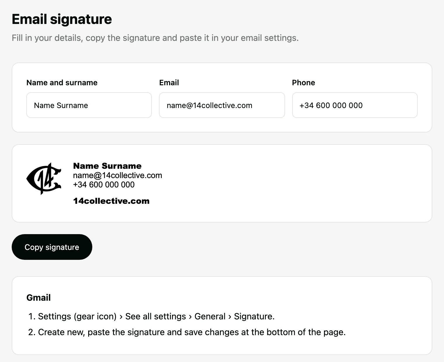
The agency delivered an 83-page brand book: a palette of white, one grey, near-black and a red accent, Franklin Gothic Black and Inter, the monogram rendered as a coin, a stone and a wax seal, a ring of fourteen points, light from below, arched photos and brand phrases. Phase 1 was a splash page, now live. Phase 2 is a one-page site in English, with About, Approach, Our collective and Contact. Phase 3 covers the team: email signatures in HTML and a CMS.
Three directions, one motion idea each
The first two rounds were the same pages with the modules reordered, and I discarded them. For the next round, each direction starts from one element of the brand book and has one motion idea that explains it.
The agency chose to mix Artefact and Spotlight, centred on people. That became the final concept.
People, light and a ring of photos
A full-screen photo opens the page, with the headline bottom left and Say hello bottom right. About sits inside a ring of photos that turns with the scroll. Then a strip of brands, Approach with four photos that open, Our collective with a pop-up per brand, a contact form and the logotype large in the footer.
On a phone it has its own layout: the ring becomes an arc under the text, the menu goes full screen and the pop-ups open as sheets from the bottom.
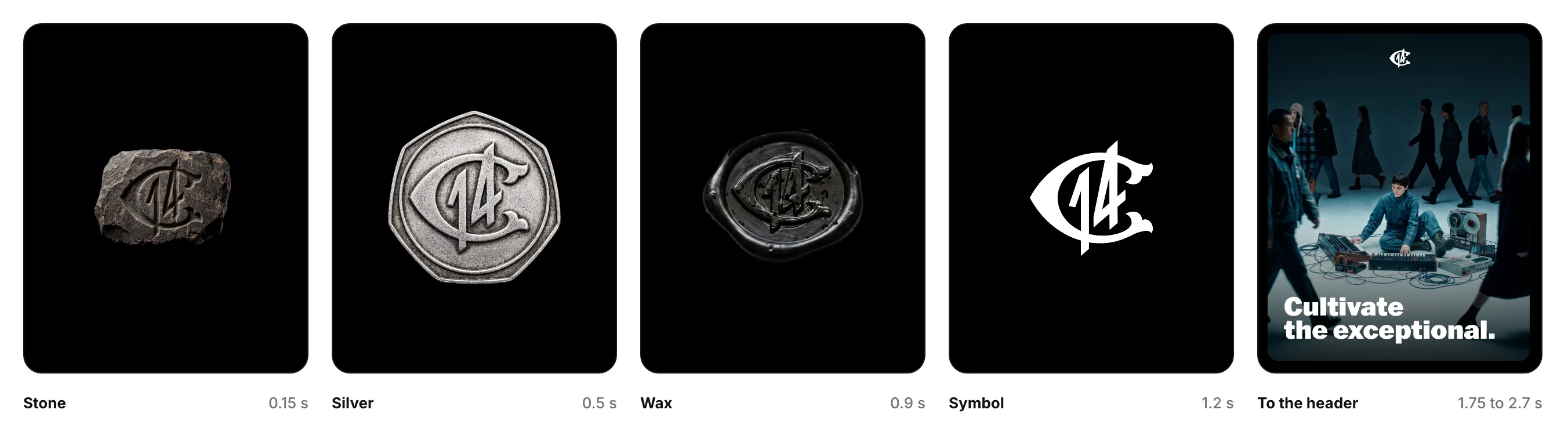
The artefact stays in the final concept as the loader. Stone, silver and wax alternate in quick cuts, the drawn symbol moves to the header and the hero opens, all within 2.7 seconds.
Five decisions and their reasons
Each one came from the agency's feedback or from a check against the brand book and accessibility.
Left out: the brand and industry pages, the red accent and mixed type weights.
360°, from concept to code
Six fronts in one project: the client and the agency, the concepts and their motion, and everything in code with AI tools. The splash page is live at 14collective.com, and the full site goes live with the group's final copy and brand logos.

Fourteen Collective: concept, motion and code for a live-culture group.
Fourteen Collective is the group behind a set of live-culture brands and festivals. The agency WeAreMorbo made its identity; North designed and built its corporate site, for investors, partners and future clients. The hard part was the creative composition and the motion. I ran the project end to end, as project manager and designer, and built the site, its CMS and the email signatures in code with AI tools.
A brand book, and three phases
The agency delivered an 83-page brand book: a palette of white, one grey, near-black and a red accent, Franklin Gothic Black and Inter, the monogram rendered as a coin, a stone and a wax seal, a ring of fourteen points, light from below, arched photos and brand phrases. Phase 1 was a splash page, now live. Phase 2 is a one-page site in English, with About, Approach, Our collective and Contact. Phase 3 covers the team: email signatures in HTML and a CMS.
Three directions, one motion idea each
The first two rounds were the same pages with the modules reordered, and I discarded them. For the next round, each direction starts from one element of the brand book and has one motion idea that explains it.
The agency chose to mix Artefact and Spotlight, centred on people. That became the final concept.
People, light and a ring of photos
A full-screen photo opens the page, with the headline bottom left and Say hello bottom right. About sits inside a ring of photos that turns with the scroll. Then a strip of brands, Approach with four photos that open, Our collective with a pop-up per brand, a contact form and the logotype large in the footer.
On a phone it has its own layout: the ring becomes an arc under the text, the menu goes full screen and the pop-ups open as sheets from the bottom.
The artefact stays in the final concept as the loader. Stone, silver and wax alternate in quick cuts, the drawn symbol moves to the header and the hero opens, all within 2.7 seconds.
Five decisions and their reasons
Each one came from the agency's feedback or from a check against the brand book and accessibility.
Left out: the brand and industry pages, the red accent and mixed type weights.
360°, from concept to code
Six fronts in one project: the client and the agency, the concepts and their motion, and everything in code with AI tools. The splash page is live at 14collective.com, and the full site goes live with the group's final copy and brand logos.