
Built by engineers, for engineers — in a domain with no playbook to copy.
Tangled navigation, long flows, no onboarding, no empty states. None of it was cosmetic — restyling couldn't touch it, because the confusion was structural. It lived in what the product thought its own parts were.
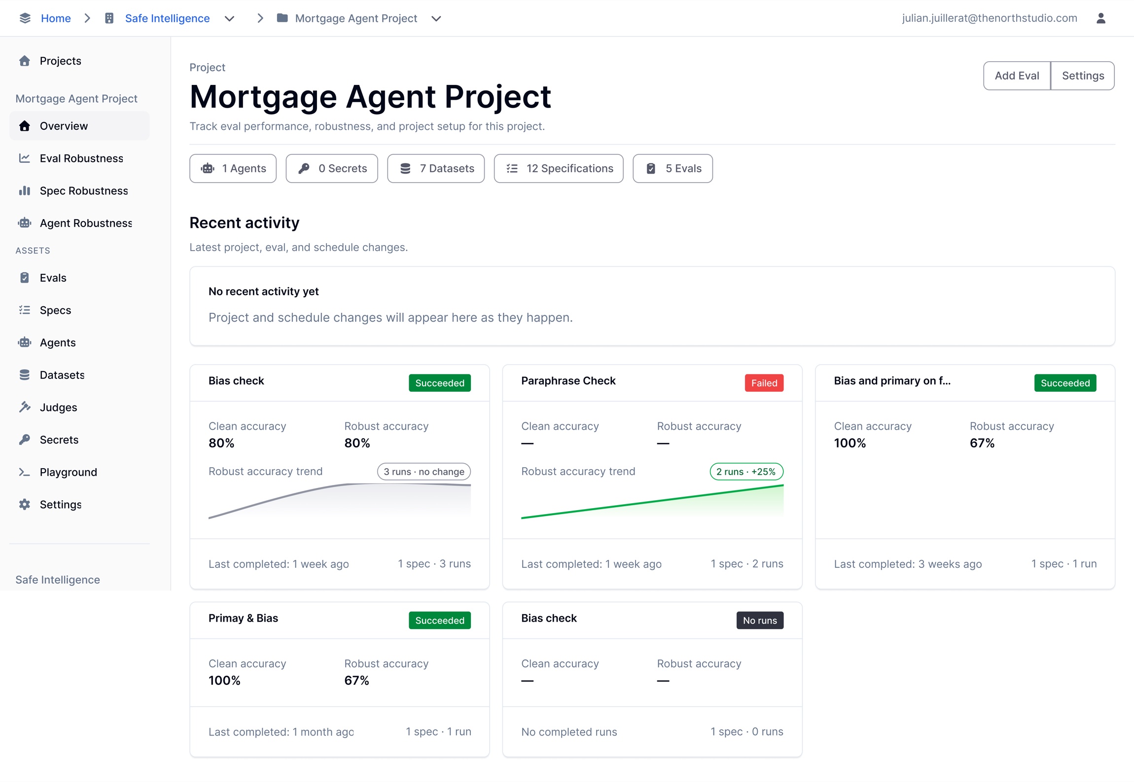
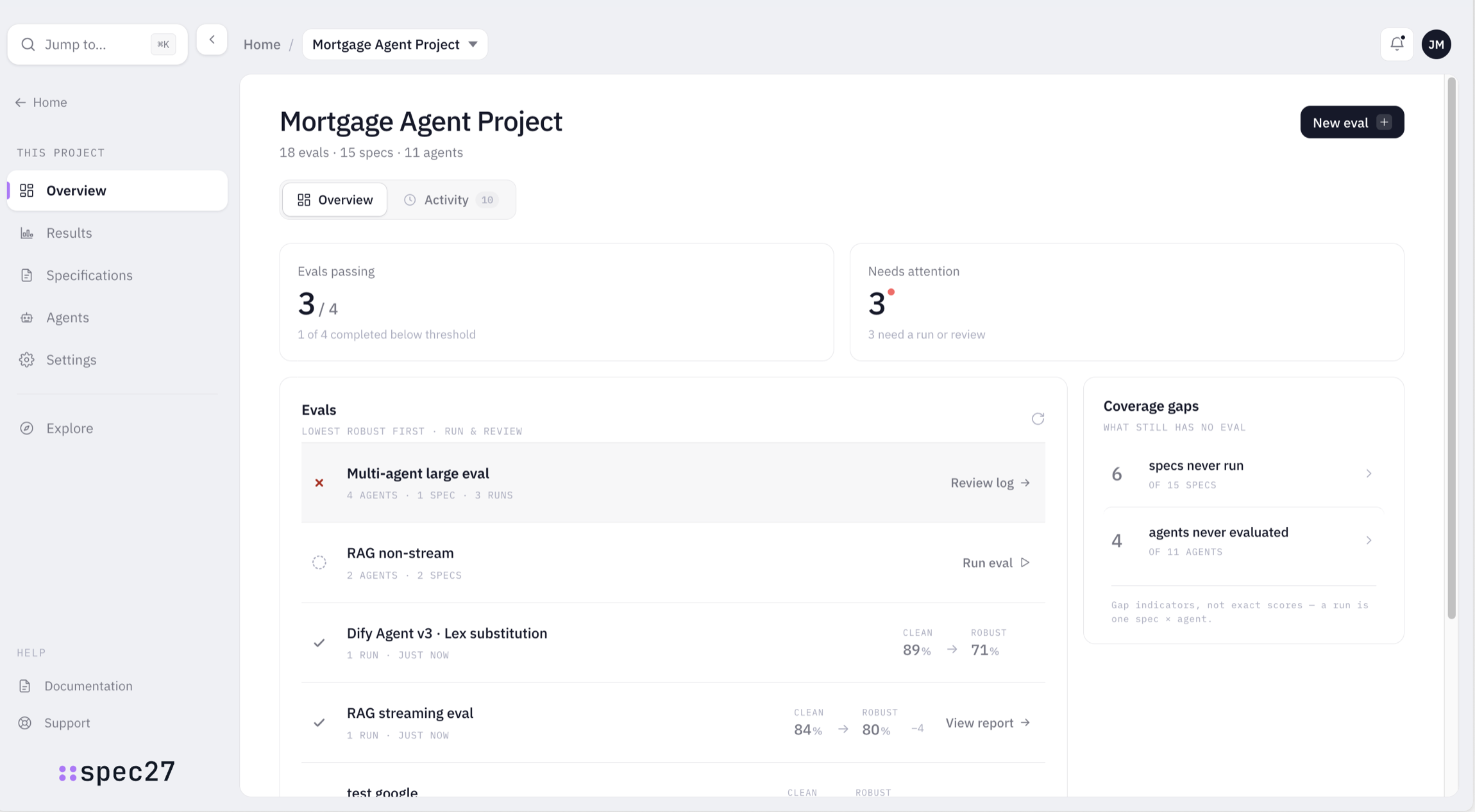
With the model right, the rest was execution.
Most of what came next was disciplined execution on a foundation that finally made sense: flows rebuilt end to end, navigation that mirrored the two real resources, and onboarding and empty states where there had been none.
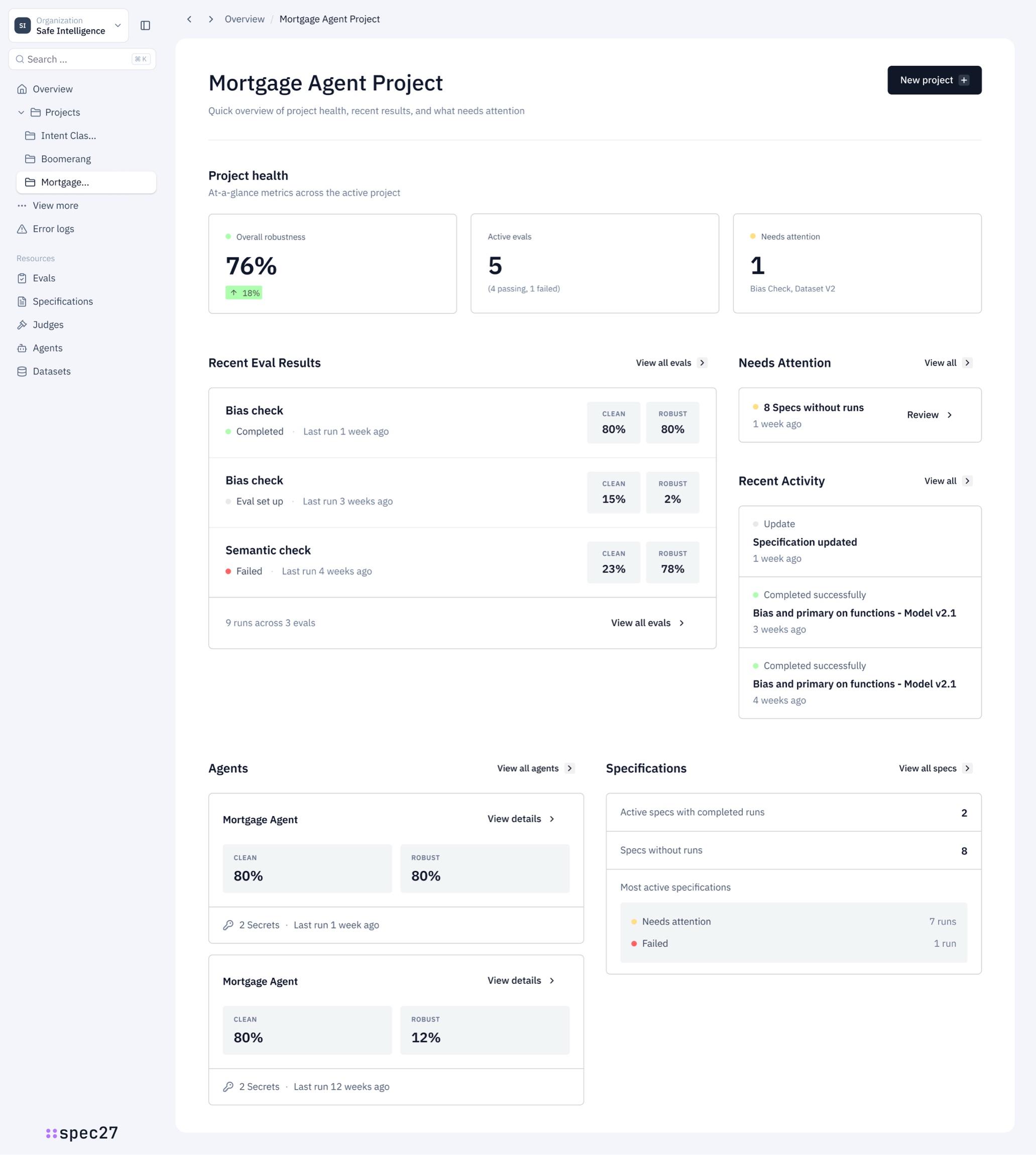
The same overview, at every stage of the engagement.
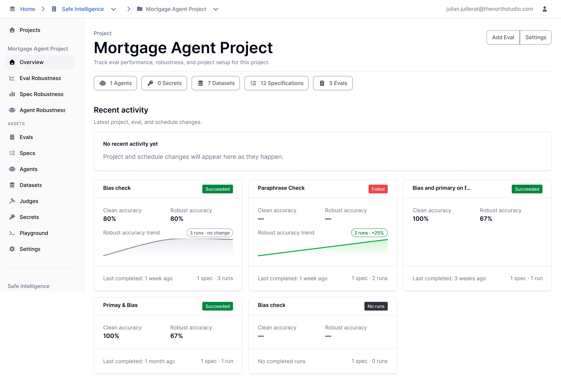
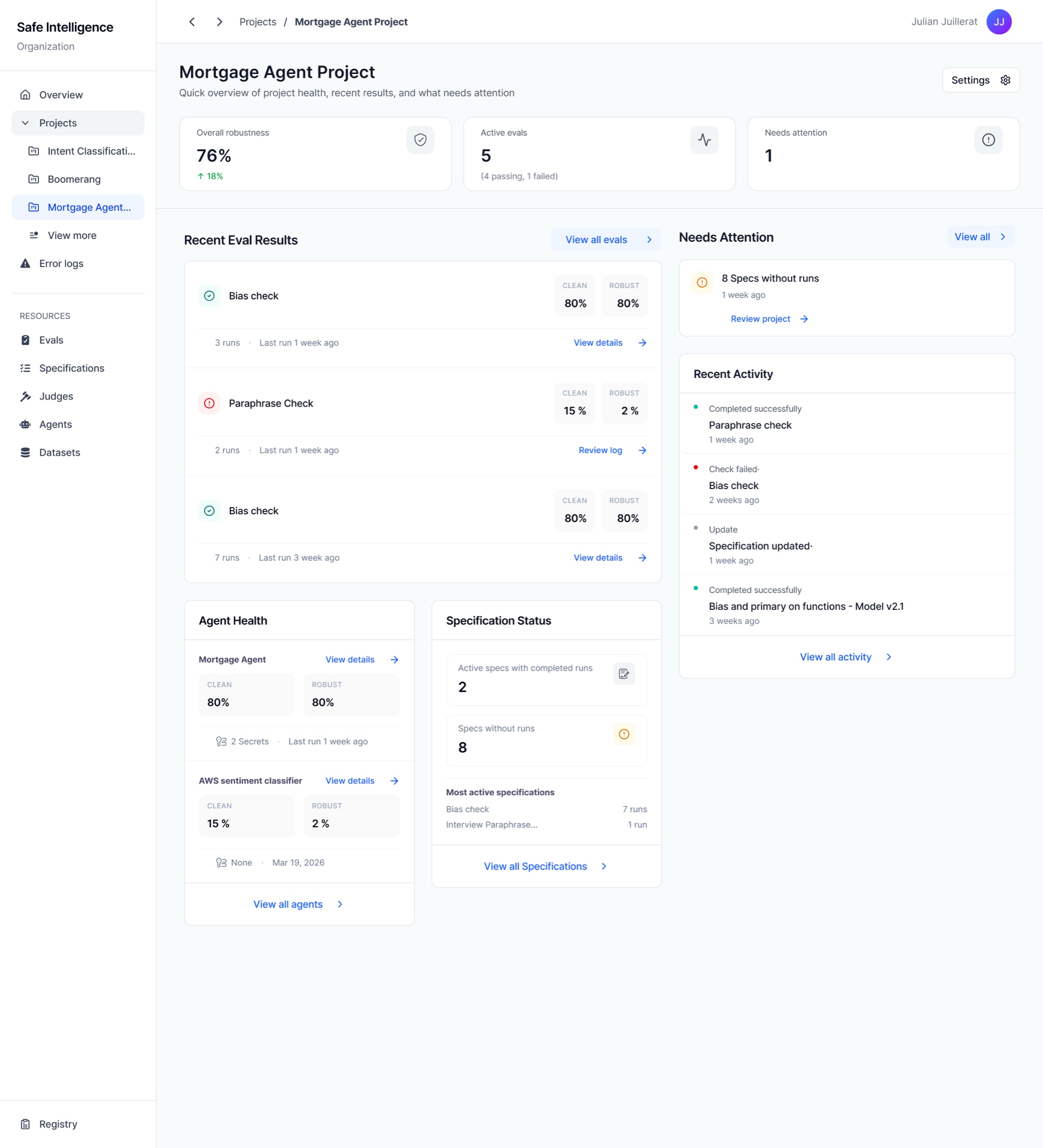
Two phases: quick wins first, then the full redesign.
A close deadline split the job in two: first, every quick win the date allowed — then six to seven weeks to do the full redesign properly.
Three core screens plus navigation, no room for the standard design→present→validate→revise cycle: assumptions explicit, tight rounds, rationale annotated in Figma for async sign-off. What shipped was the product's first conceptualisation — a UI the full redesign would replace.
Run as a program: every rebuilt screen inherited the new base, then flows, nav, screens and a design system — phased, with checkpoints, buffers and a weekly cadence. Design and build ran in parallel; the plan kept parallel from becoming chaos.
Working sessions with the engineers off the back of each discovery, AI to explore concepts fast — never to replace the thinking. The design system stayed the single reference; nothing invented.
Model questions were settled on something clickable, not in the abstract. Calls made ahead of sign-off, kept cheap to reverse — and always flagged: decided, or still assumed.
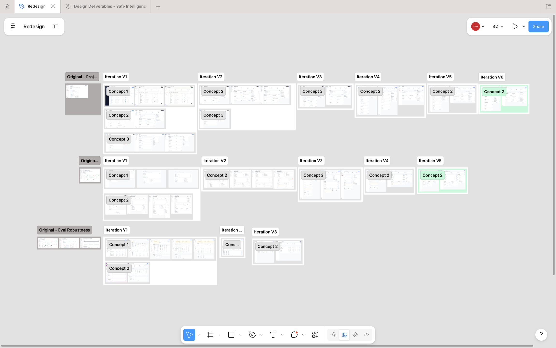
The whole product — redesigned end to end, shipped in two weeks.
This wasn't one screen or one flow — it was the two-resource model, every rebuilt flow, the onboarding and empty states it never had, on a governed component system. And because I handed engineering the build as working HTML — tokens, components and states, not comps to reinterpret — the full rebuild shipped in the last two weeks of an eight-week project, in time for a major relaunch. It's live at staging.spec27.ai.
The problem the redesign targeted — confirmed after launch.
The whole rebuild rested on one diagnosis: the product dropped users into an editor without modelling what to do with it — no onboarding, no obvious first move. After launch, the team ran its own analysis of early churned sign-ups, reconstructing their journeys from production traces. It surfaced the same gap independently — new users moving through the interface without ever reaching the core action the product exists for. The work set out to fix exactly that, and the client's own post-launch read confirmed it was the right problem to solve.
No before/after usage to claim yet — fewer than ten people could use the product before the rebuild, so the relaunch cohort is the first real one. Conversion instrumentation on the rebuilt flows is being defined now; activation metrics follow from there. What's already proven stands on its own: the structural fix, the step and surface reductions, and a diagnosis the client's own data backed.
“The UI was an absolute mess, and your guidance was instrumental in making it coherent.”— The client's engineer
The CEO credited the team for staying focused at the right level — solving the real problem rather than pushing a grand redesign.— The client's CEO
Click through the actual build.
The build itself, fully navigable: create a project, open the specification editor, run an eval.
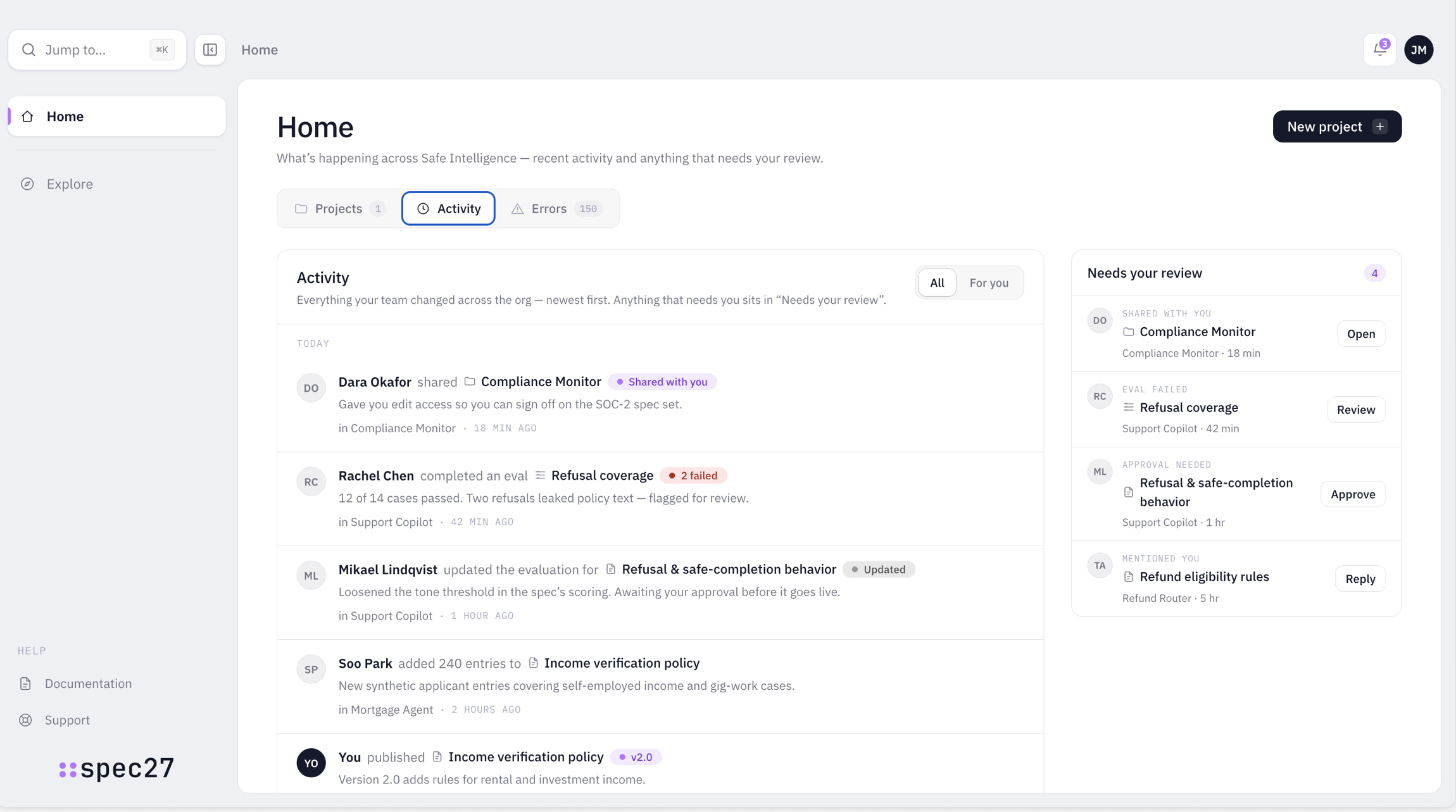
The system's first job was a primary action you couldn't miss.
The audit named the root problem: no primary-action hierarchy. The one correct next move was styled like every secondary control beside it, so users stalled. The system is defined by its rules before its parts — a handful of enforced decisions that make the right action obvious on every screen.
Neutral at rest, accent on press. The next step is never ambiguous.
Purple marks the primary path and nothing else. It always means “go here”.
State is a small coloured dot, never a whole coloured component — dense data stays calm.
36px controls and a fixed radius scale. Buttons, inputs and selects line up without a decision.